Nintendo Rebrand Concept

about.
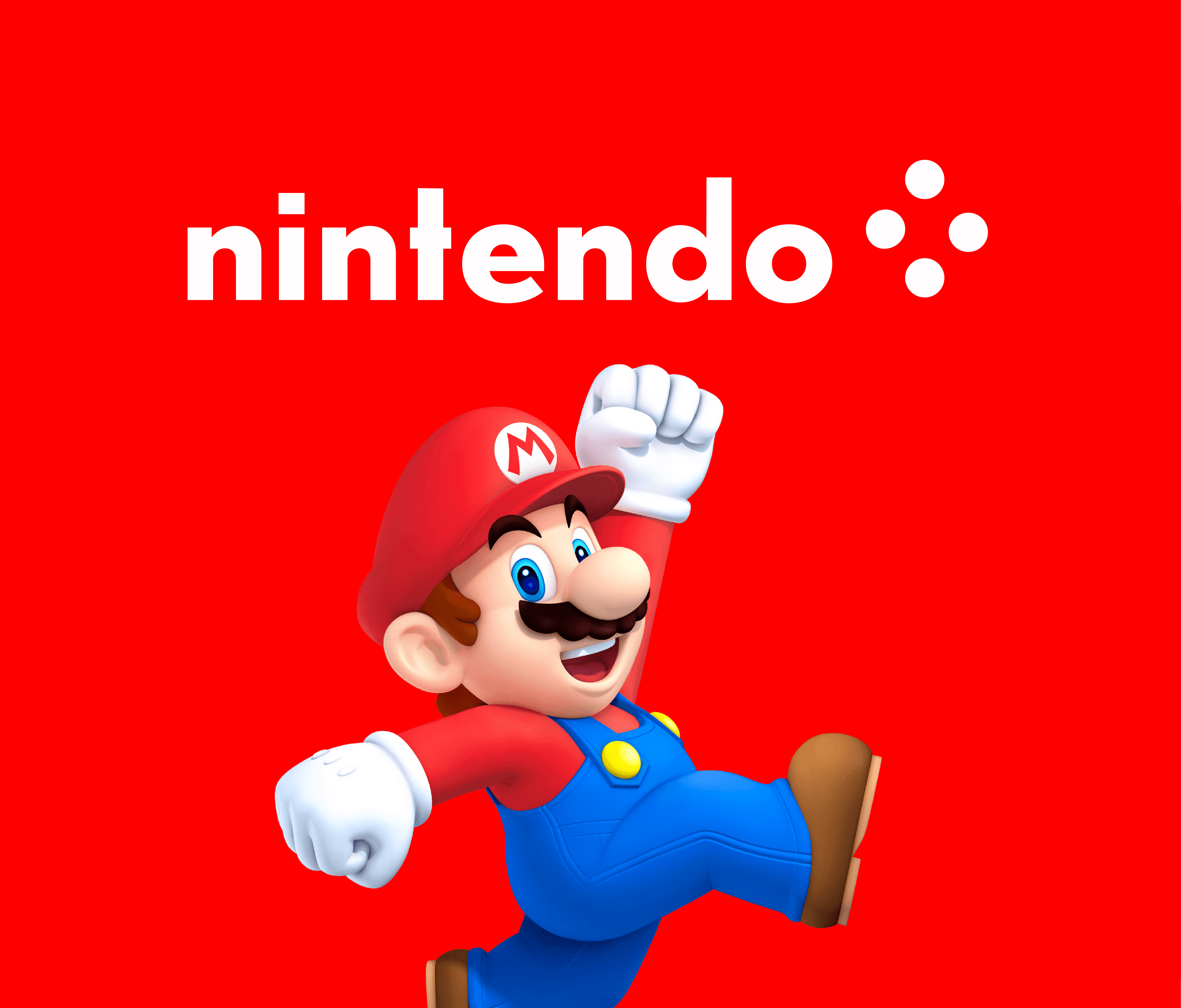
This conceptual reimagined brand identity for Nintendo explores a minimalist, modern direction while preserving the company’s playful legacy. The redesign centers around a clean wordmark paired with a custom icon inspired by the classic D-pad—simplified into four dynamic dots to symbolize connectivity, nostalgia, and interaction.
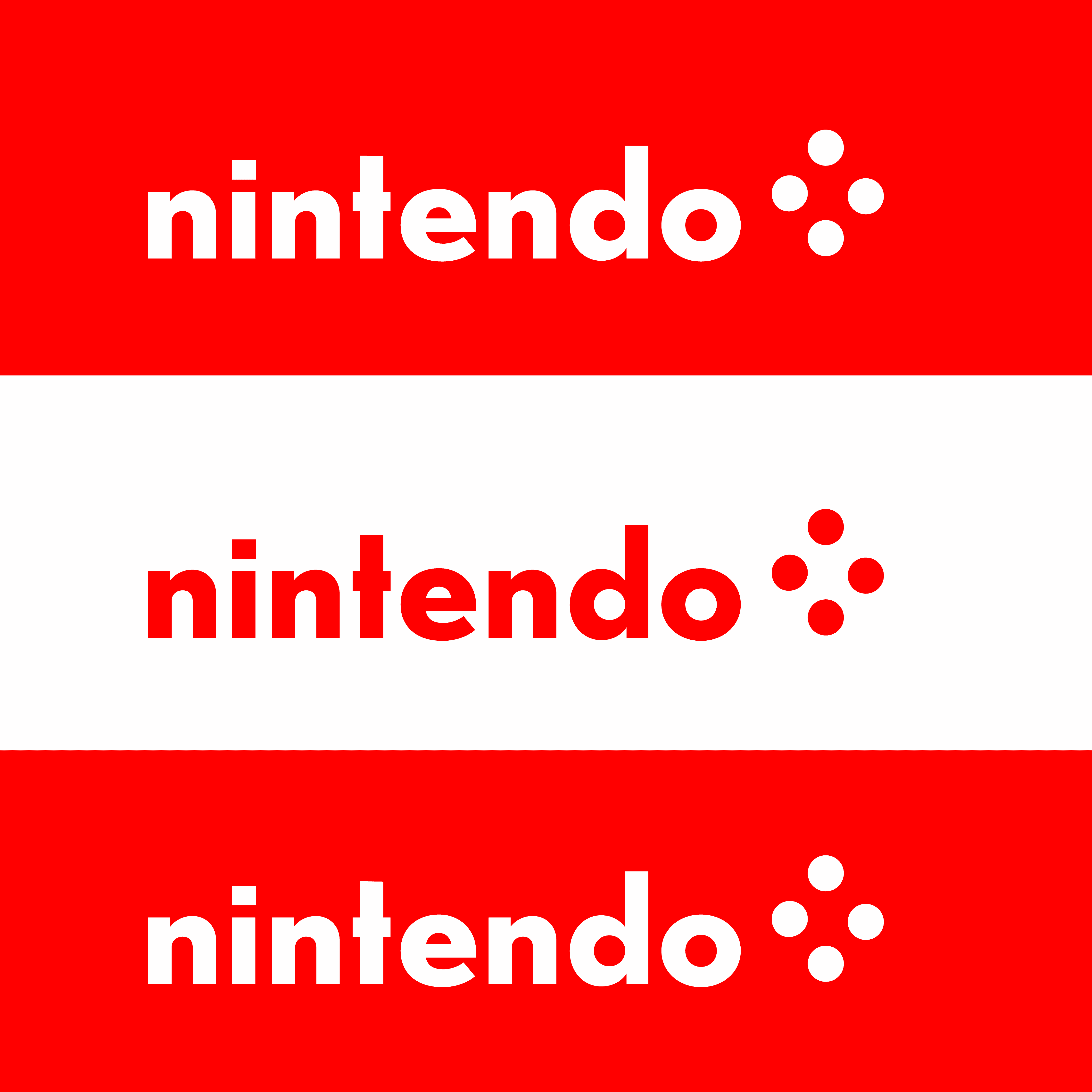
The logo system was designed with flexibility in mind, easily applied across signage, digital interfaces, and promotional materials. The bright red and white palette anchors the identity in Nintendo’s iconic color scheme, ensuring instant recognition while feeling fresh and contemporary.
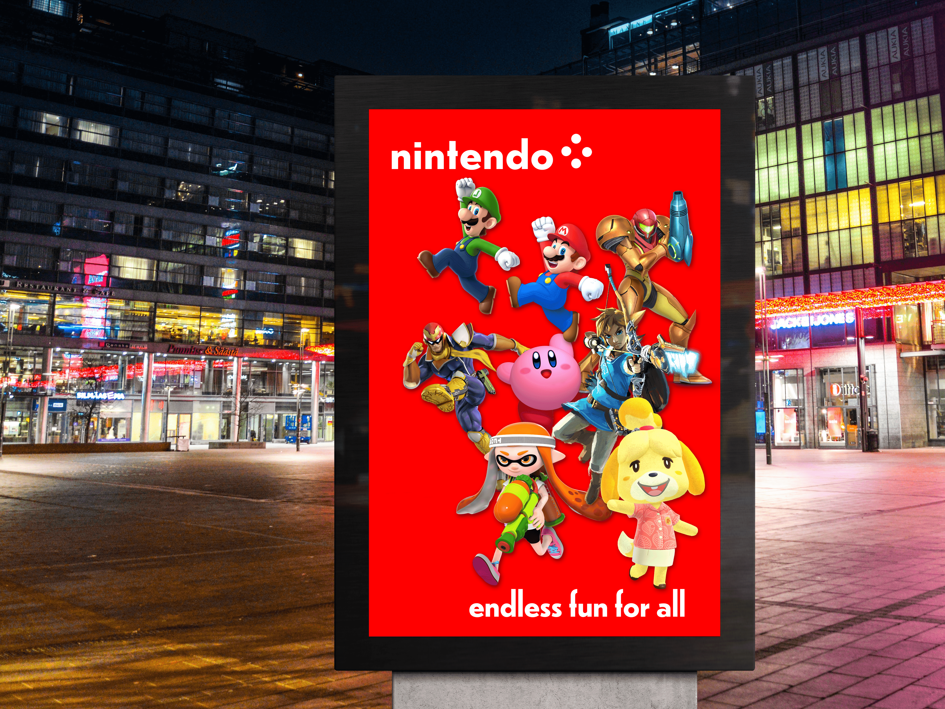
Brand applications included retail signage and an outdoor campaign with the tagline “Endless fun for all,” celebrating Nintendo’s wide-reaching, intergenerational appeal through bold character imagery and vibrant design. This project balances brand heritage with a forward-thinking visual language tailored for modern audiences.